Overview
Charts are interactive visualizations you add to a dashboard. To build one, drag a Figure widget onto the canvas, pick a data source, set your dimensions and metrics, and choose a chart type. The preview updates as you configure it, so there is no separate “render” step.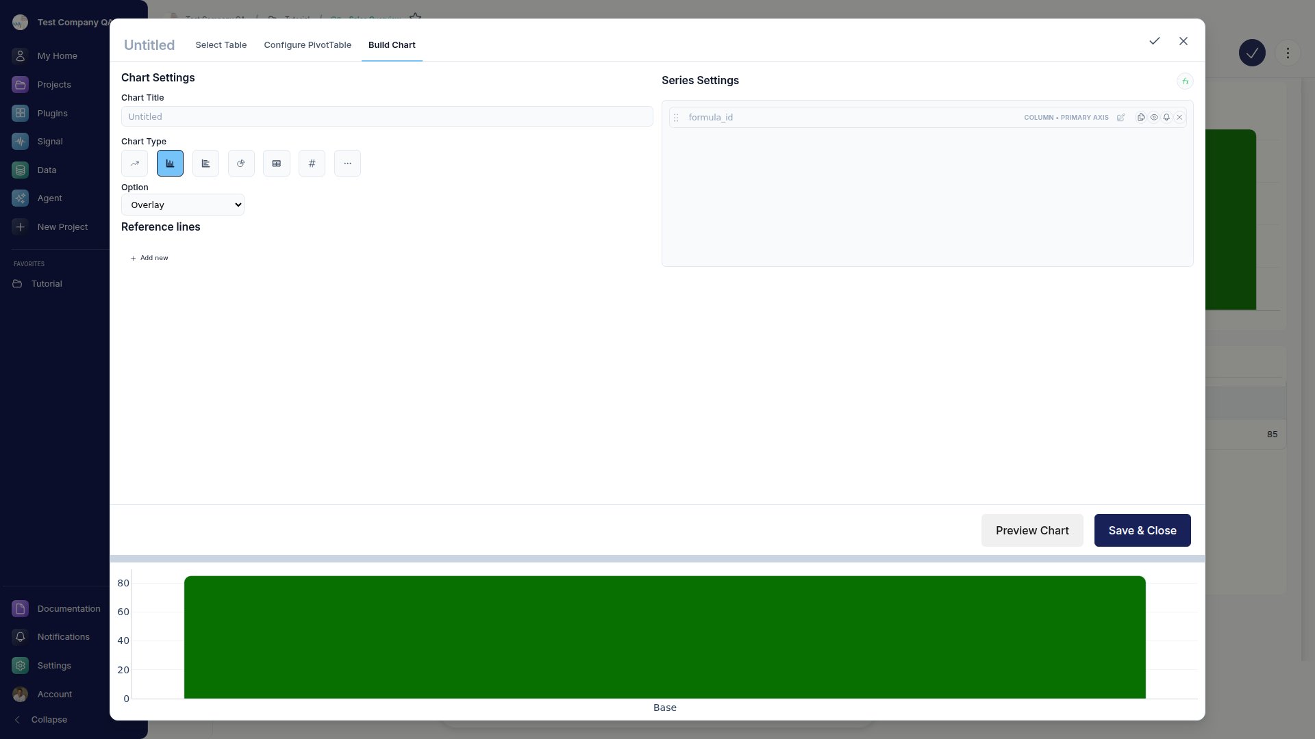
Chart Types
Go Fig has 14 chart types in two groups:
A quick rule of thumb: time series go to Line or Area, category comparisons to Column or Bar, part-to-whole to Pie, a single KPI to Metric, correlation to Scatter, and stage drop-off to Funnel.
Most charts support grouped, stacked, and 100% stacked variations when you add a series (breakdown) dimension. Switching chart type keeps your dimensions and metrics, so you can try a few without reconfiguring.
Metric Widgets
Metric widgets show a single value with optional period-over-period comparison and a sparkline. For metrics where down is good (costs, defect rate), enable inverse colors so a decrease shows green.Maps
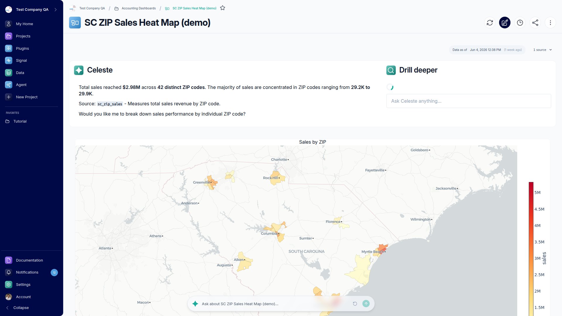
Maps plot geographic data and have three styles:- Bubbles: sized circles, where circle size is your metric value
- Density: a heatmap overlay showing concentration
- Filled: shaded regions (choropleth), where darker means higher
Heatmaps
Heatmaps need an X dimension, a Y (pivot) dimension, and a value metric.Trend Lines and Anomaly Detection
On Line, Column, Bar, Area, and Scatter charts, you can add a trend line or turn on anomaly detection per metric (click a metric in the Values bucket to find these).- Trend lines: Linear, Logarithmic, Exponential, Polynomial, Power, or Moving Average. Optionally show the equation on the chart.
- Anomaly detection: outlier points appear as red diamond markers.