

What This Node Does
The Chart node renders a chart from your data directly in the Flow. Pick your dimensions and metrics and Go Fig draws a bar, line, pie, or other chart type right on the canvas. It is an output node.When to Use This Node
Use the Chart node when you want to:- Visualize a Flow result without building a separate dashboard
- Embed a chart in a scheduled email
- Sanity-check a transformation at a glance
Step-by-Step Usage Guide
1
Add Chart
From the ”+ Add node” popover, search for “chart” and add it at the end of your Flow.
2
Choose dimensions and metrics
Pick the dimensions to break the chart out by and the metrics to plot. Drag fields from the Field List into the Rows (X-Axis), Columns (Series), and Values buckets.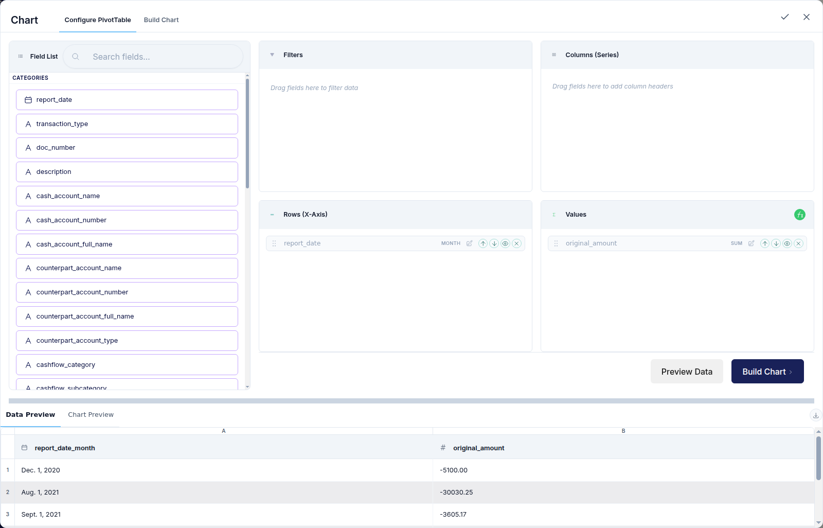
3
Pick a chart type
Select bar, line, pie, or another type that fits the story in your data.